Content Builder
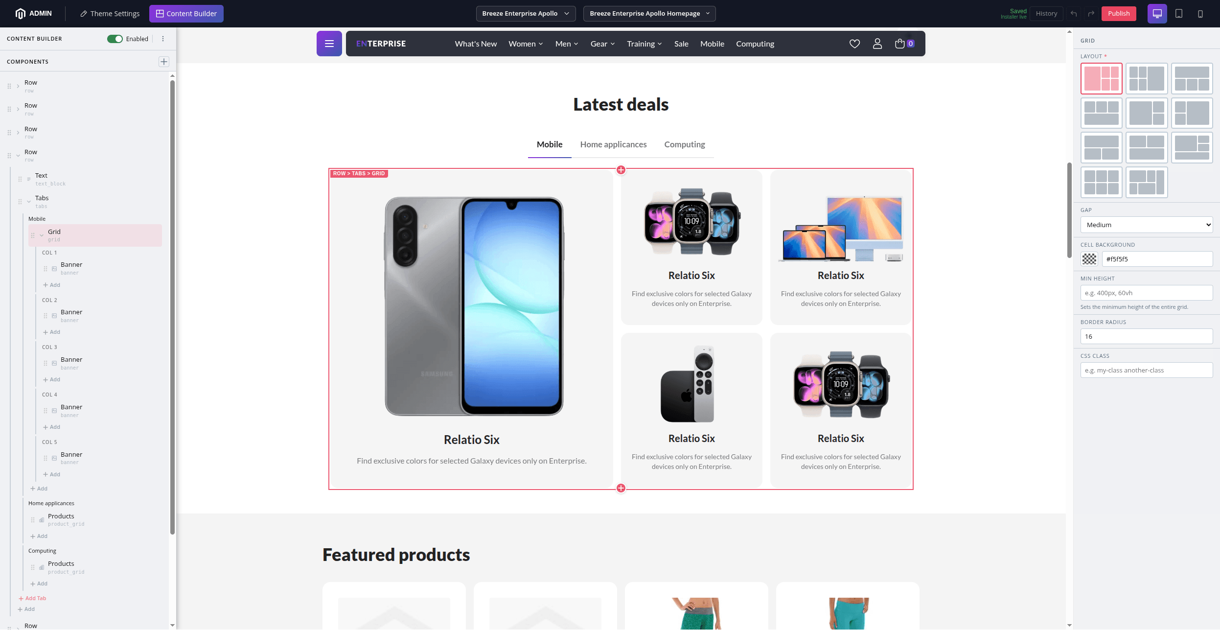
Breeze Content Builder (BCB) lets you build CMS pages with a drag-and-drop component editor. It lives inside the Breeze Theme Editor and gives you a live preview of the page as you work.
Opening the Editor
- Go to Swissup > Breeze > Breeze Theme Editor in the Magento admin menu.
- Press the Content Builder button in the top bar.
- Choose a CMS page from the page selector in the toolbar.
Choose Swissup > Breeze > Content Builder to access the Breeze Content Builder directly.
Enabling Content Builder for a Page
BCB is opt-in per CMS page. On first opening a page, you’ll see a prompt to enable it. Toggle the switch to activate BCB for that page.
You can also enable it from the CMS page edit form in Content > Pages.
Once enabled, BCB replaces the native Page Builder or HTML content for that page.
Adding and Arranging Components
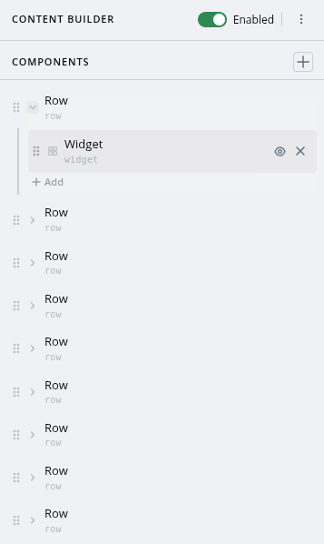
The component tree on the left shows all components on the page.
- Click + to add a new component — choose from the available types.
- Drag components up or down to reorder them.
- Click the x icon to delete a component.
- Use Ctrl+C / Ctrl+V to copy and paste components.
Configuring Components
Click any component in the tree to open its settings in the property panel on the right. Changes appear instantly in the preview.
Each component has its own set of fields — text, images, colors, links, and more.
Show/Hide on Desktop or Mobile
Most components have a Visibility option to show or hide them on desktop, tablet, or mobile.
Draft and Publish
All changes are saved as a draft — they are not visible to store visitors until you publish.
- Changes are saved automatically a few seconds after you stop editing.
- Click Publish to make changes live.
Publishing requires the Publish permission. If you only have edit access, you can save drafts for a publisher to review.
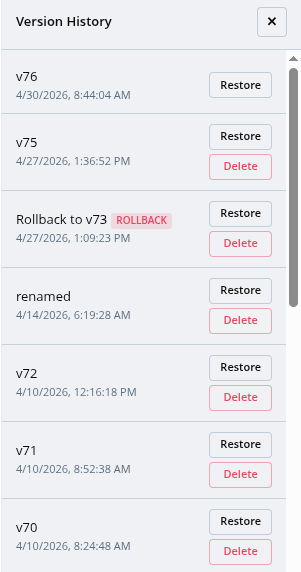
Version History
Every time you publish, a new version is created. You can view past versions and roll back to any of them at any time.
Click the History button to see the version history.
Available Components
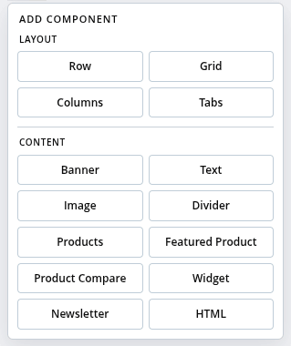
Content
| Component | What it does |
|---|---|
| Banner | Full-width banner with image, headline, text, and a button. Two layouts: Overlay (text over the image) and Stack (image above or below the text). |
| Text | Heading with rich text body. Supports an optional icon, text alignment, background, and text color. |
| Image | Standalone image with optional caption and link. |
| Divider | Horizontal line with configurable color, thickness, and width. |
| Products | Product grid or carousel. Source products from a category, enter SKUs manually, or define conditions. |
| Featured Product | Single product in a two-column layout — image on the left, details on the right. |
| Product Compare | Side-by-side comparison table for 2–4 products. |
| Widget | Any standard Magento widget. |
| Newsletter | Newsletter subscribe form with optional heading and text. |
| HTML | Custom HTML with support for Magento directives ({{widget}}, {{config}}, etc.). |
Layout (Containers)
| Component | What it does |
|---|---|
| Row | A vertical container. Supports contained or full-width appearance, background color/image, and spacing. |
| Columns | Side-by-side columns. Choose from 5 presets: 50/50, 33/33/33, 25×4, 33/66, 66/33. |
| Grid | CSS Grid with 11 layout presets (collage, hero, sidebar, magazine, gallery, bento, and more). |
| Tabs | Tabbed panels with configurable titles and styling. |
Admin Permissions
Access to the Content Builder can be restricted per admin role:
| Permission | What it allows |
|---|---|
| View | Open the editor and view drafts |
| Edit | Add and edit components, save drafts |
| Publish | Publish changes to the storefront |
| Rollback | Restore a previous published version |
Configure permissions in System > User Roles.