Lightbox Pro
General settings
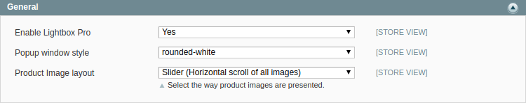
Select Yes to enable Lightbox Pro extension.
You can also select style of popup window for image:
- drop shadow;
- glossy-dark;
- outer-glow;
- rounded-black;
- rounded-white.
With option Product Image layout you can choose between default layout with thumbnails and slider with all images.
Image sizes
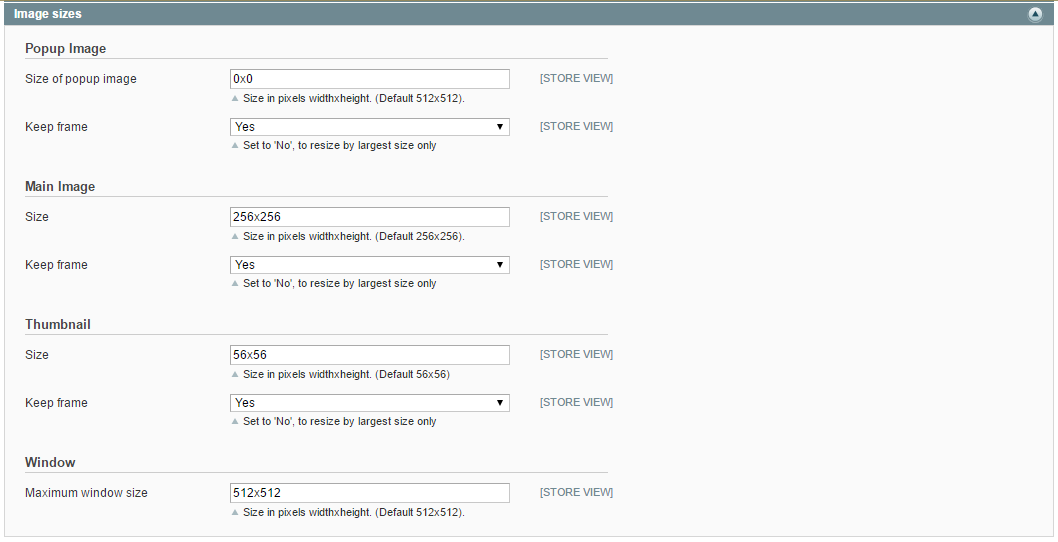
Please specify the size for main and popup images, for a thumbnail and a window. In Keep frame field select Yes in case you want the image have a size you specified.
Gallery
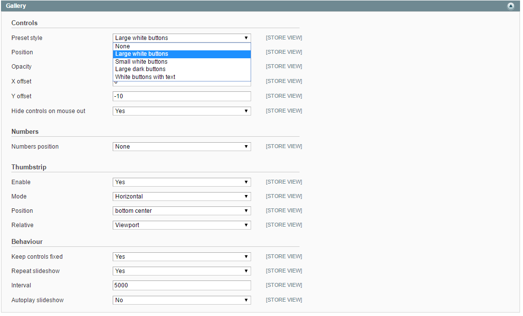
Controller options settings allow you to configure the control keyboard for better navigation the image.
Preset style- choose a preset style for controls on the image.Position- select the positions for controls.Opacity- specify the opacity for controls.X offset- specify the X offset for the controls.Y offset- specify the Y offset for the controls. Note: offsetting the input image can align it to a reference image.Hide controls on mouse out- select Yes if you need to hide controls before you drag your mouse over the image.
Numbers setting allows you to place the image pages numbers according to your needs.
Numbers position- select the number position for image pages. Possible values areNone, Heading and Caption.
Thumbstrip settings will help you to configure the sketches of possible lightbox images.
Enable- select Yes to enable thumbstrip.Mode- select the display mode of thumbstrip. Possible values areHorizontal, Vertical and Float.Position- select the display position of thumbstrip.Relative- select the display position of thumbstrip. Possible values areImage, Expander and Viewport.
Behaviour settings allow you to adjust the image position.
Keep controls fixed- select Yes if you want to align subsequent slides so that the controls are in the same position for the next image. This means the user can browse through the images using the “Next” button without moving the mouse.Repeat slideshow- select Yes to repeat slideshow.Interval- specify the interval for slideshow.Autoplay slideshow- if you select Yes, the slideshow starts without clicking on controls.
Style
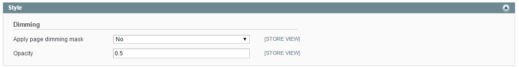
Apply page dimming mask- select Yes to add a translucent mask above the page behind the lightbox image.Opacity- specify the opacity for the dimming mask.
Behaviour
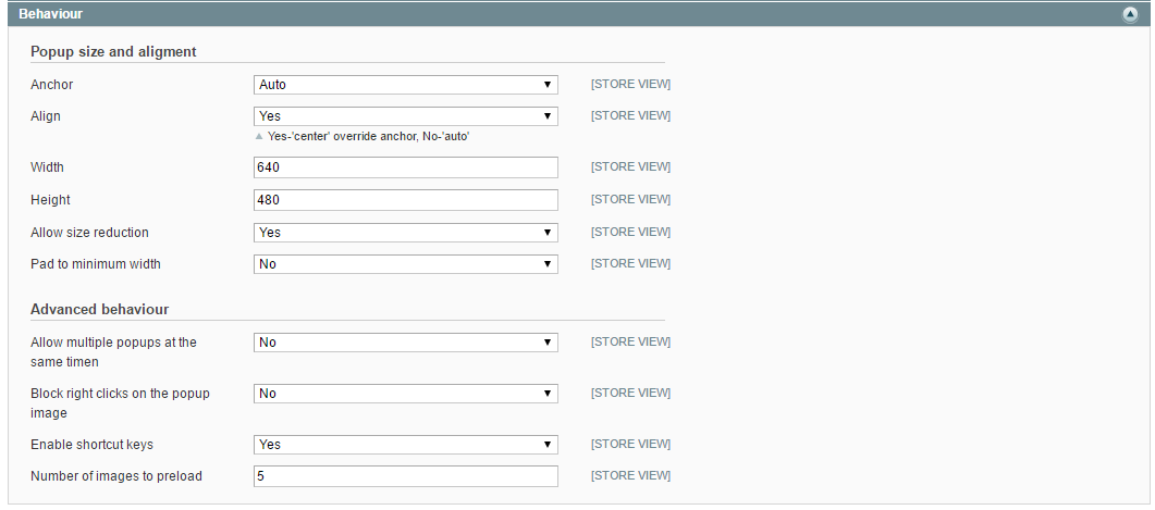
Anchor- select the alignment of the lightbox image in the viewport.Align- if you select Yes, the anchor will be overridden in the center. If you select No, the anchor will be overridden automatically.Width- specify the lightbox image content width.Height- specify the lightbox image content height.Allow size reduction- select Yes to allow the image to shrink to install a small viewport. If the viewport is small, the expanded pictures by default shrink to fit the area.Pad to minimum width- select Yes to enable the pad for the caption on narrow images. Note: the minimum width should be set in the Width field before.
Advanced behaviour settings will help you to speed up viewing multiple images at once.
Allow to multiple popups at the same time- select Yes to allow multiple popups to be open at the same time.Block right clicks on the popup image- select Yes to block the right clicks and context menu on the lightbox image.- Enable shortcut keys` - select Yes to enable the shortcuts keys.
Number of images to preload- specify the number of images to be preloaded on the page by default.
Overlays
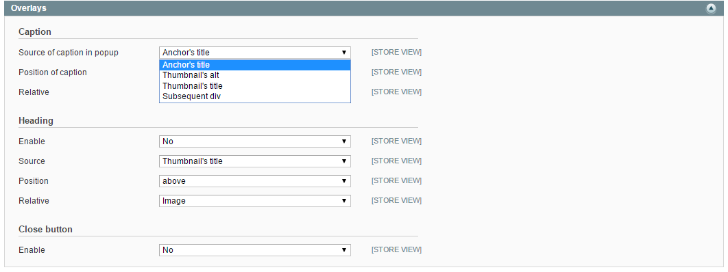
Caption
Source- please select the source where to get the caption text in the HTML code.Position- select the caption position.Relative- select the position of the caption relative to the image or the viewport.
Heading
Enable- select Yes to enable the heading display.Source- please select the source where to get the caption text in the HTML code.Position- select the heading position.Relative- select the position of the heading relative to the image or the viewport.
Close button
In case you select Yes in Enable field, you overlay a Close button (X). In other words you offer users to click outside the image in order to close a window. Please notice, it will be a kind of usability flaw for unexperienced online users.