Dropdown columns
Dropdown columns tab gives you control over dropdown content of selected category. By default, dropdown columns has subcategory column only. But you may add additional columns aside of subcategory listing, or even replace subcategory column with custom block.
Contents
- Backend Interface
- Status Exceptions
- Column types:
- Use Cases:
Backend
Each type of dropdown column provide configuration options that can be used to customize menu according to your needs.
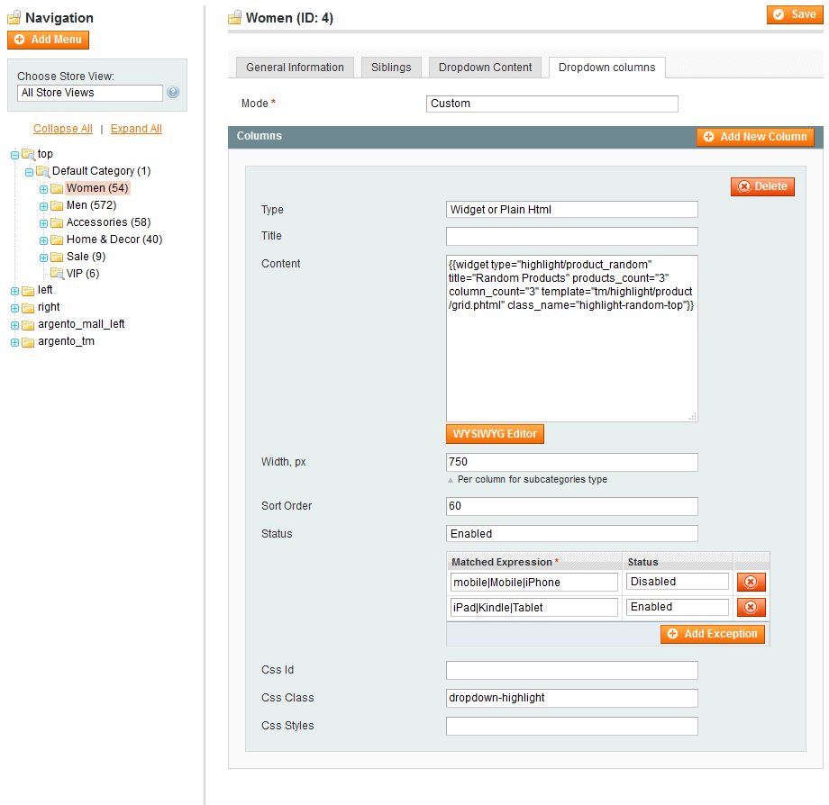
| Subcategories column | Widget Column |
|---|---|
 |
 |
General options:
- Status
- Column Type
- Title
- Width
- Sort Order
- Css Id
- Css class
- Css styles
Status
Status option allows to disable column.
Status exceptions
Status exceptions allows you to configure menu visibility per device. You can disable large dropdowns to provide best experience for your mobile customers.
You can also use the negative look-ahead regex statement to show content for specific devices only.
The screenshot below shows how you can hide large dropdown, to improve site perfomance on phones, but show it for tablet devices.
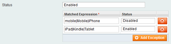
When client UserAgent matches multiple expressions - the last matched rule will be used
Column types
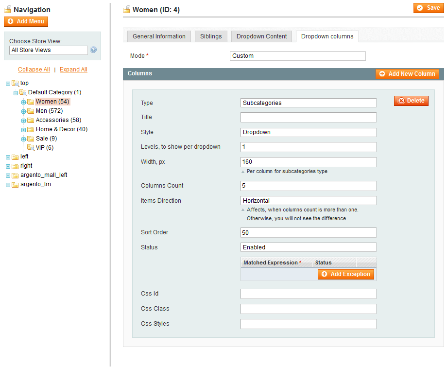
Subcategories
Subcategories dropdown is used to render and configure child categories look and feel.
Subcategories column options:
- Menu Style
- Dropdown
- Accordion
- Levels, to show per dropdown
- Columns count
- Items Direction
Items Direction
Direction option allows you to select most suitable rendering mode for your store or particular subcategory only.
Horizontal
Categories are rendered line by line. Rows visually separated from each other. Recommended, when there is almost the same subcategories count in each category.

Vertical
Categories are separated vertically. There is no visual difference between rows. This mode is recommended to use, when each category has different subcategory children count.
