Slick Carousel Usage
Contents
- Basic Usage (Static content carousel)
- Advanced Usage (Product listing carousel)
- Lazy Loading
- Responsive Display
- Using in Argento
- Slick Carousel parameters
- Slick Carousel arrow classes
Basic Usage
Let’s add a nice static carousel to homepage. We’ll use a slick
plugin to call a carousel on a static content.
-
Navigate to
CMS > Pagesand select appropriate homepage.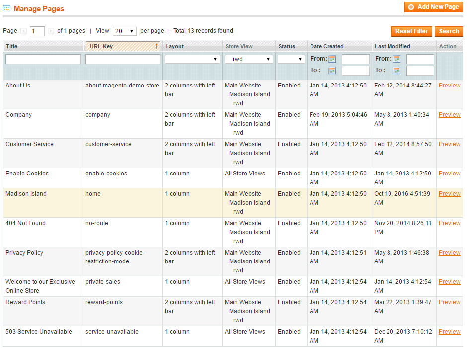
-
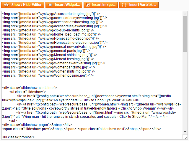
Insert slider images using “Insert Image…” button.
-
Wrap images into
divwith specified slick parameters:<div class="slick gray" data-slick='{"slidesToShow": 5, "slidesToScroll": 1, "infinite": true, "swipeToSlide": true}'> ... </div>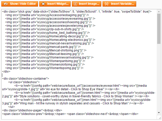
-
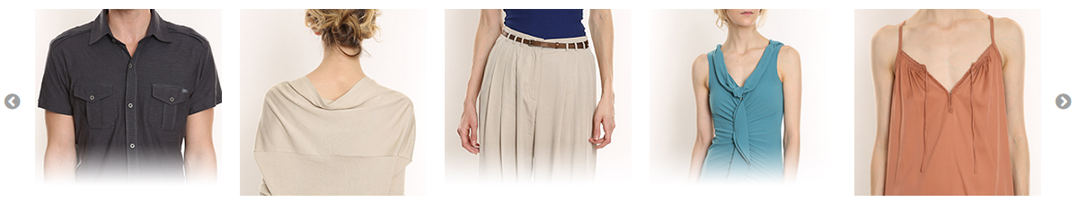
Save the page and navigate to your homepage frontend:
Advanced Usage
Let’s insert Catalog New Products List widget to homepage and transform it into Slick Carousel.
We’ll use slickwrapper plugin to call a carousel on a dynamically generated
content.
-
Navigate to
CMS > Pagesand select homepage. -
Insert new product listing widget.
{{widget type="catalog/product_widget_new" display_type="all_products" products_count="20" template="catalog/product/widget/new/content/new_grid.phtml"}} -
Add new
column_countparamether to widget and set it value to be equal toproducts_count{{widget type="catalog/product_widget_new" display_type="all_products" products_count="20" column_count="20" template="catalog/product/widget/new/content/new_grid.phtml"}} -
Wrap this widget into
divwitheloption and specified slick parameters:<div class="slick-wrapper gray" data-slick-wrapper='{"el": ".products-grid", "slidesToShow": 5, "slidesToScroll": 5, "dots": true}'> ... </div>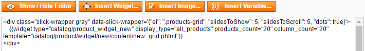
-
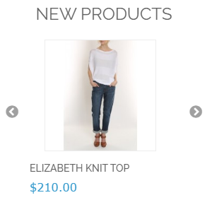
Save the page and navigate to your homepage frontend:

Lazy Loading
You can use Slick lazy loading feature for static content carousels. To do it,
simply remove image src attribute and place image url in data-lazy attribute.
Also you need to add style="width: 100%;" for every image:
<div class="slick gray" data-slick='{"slidesToShow": 5, "slidesToScroll": 1, "infinite": true, "swipeToSlide": true}'>
    <div><img style="width: 100%;" data-lazy="{{media url="wysiwyg/Accessoriesbagimg.jpg"}}" /></div>
    <div><img style="width: 100%;" data-lazy="{{media url="wysiwyg/accessorieseyewearimg.jpg"}}" /></div>
    <div><img style="width: 100%;" data-lazy="{{media url="wysiwyg/accessoriesshoesimg.jpg"}}" /></div>
    <div><img style="width: 100%;" data-lazy="{{media url="wysiwyg/acessoreiesjeweleryimg.jpg"}}" /></div>
    <div><img style="width: 100%;" data-lazy="{{media url="wysiwyg/clp-sub-m-shirts.jpg"}}" /></div>
    <div><img style="width: 100%;" data-lazy="{{media url="wysiwyg/home_bed_bathimg.jpg"}}" /></div>
    <div><img style="width: 100%;" data-lazy="{{media url="wysiwyg/Homecatimg-decor.jpg"}}" /></div>
    <div><img style="width: 100%;" data-lazy="{{media url="wysiwyg/Homecatimg-electronics.jpg"}}" /></div>
    <div><img style="width: 100%;" data-lazy="{{media url="wysiwyg/mencat-newarrivalsimg.jpg"}}" /></div>
    <div><img style="width: 100%;" data-lazy="{{media url="wysiwyg/mencat-pants.jpg"}}" /></div>
    <div><img style="width: 100%;" data-lazy="{{media url="wysiwyg/Mencat-shirtsimg.png"}}" /></div>
    <div><img style="width: 100%;" data-lazy="{{media url="wysiwyg/Mencat-teesimg.jpg"}}" /></div>
    <div><img style="width: 100%;" data-lazy="{{media url="wysiwyg/Womennewarrivalsimg.jpg"}}" /></div>
    <div><img style="width: 100%;" data-lazy="{{media url="wysiwyg/Womenpantsimg.jpg"}}" /></div>
    <div><img style="width: 100%;" data-lazy="{{media url="wysiwyg/Womenskirtsimg.jpg"}}" /></div>
    <div><img style="width: 100%;" data-lazy="{{media url="wysiwyg/Womentopsimg.jpg"}}" /></div>
</div>
Responsive Display
Slick responsive display feature allows you to set different slider options for different screen sizes.
For example, with the following code:
<div class="slick-wrapper gray" data-slick-wrapper='{"el": ".products-grid", "slidesToShow": 5, "slidesToScroll": 5, "dots": true, "responsive": [ {"breakpoint": 770, "settings": {"slidesToShow": 4, "slidesToScroll": 4}}, {"breakpoint": 640, "settings": {"slidesToShow": 3, "slidesToScroll": 3}}, {"breakpoint": 480, "settings": {"slidesToShow": 2, "slidesToScroll": 2}}, {"breakpoint": 321, "settings": {"slidesToShow": 1, "slidesToScroll": 1, "dots": false}}]}'>
    {{widget type="catalog/product_widget_new" display_type="all_products" products_count="20" column_count="20" template="catalog/product/widget/new/content/new_grid.phtml"}}
</div>
slider will be looking like this:
-
screens above 770px will use default settings:
-
screens from 640px to 770px will show 4 slides:

-
screens from 480px to 640px will show 3 slides:

-
screens from 321px to 480px will show 2 slides:

-
screens below 321px will show 1 slide and disable dots navigation:
Using in Argento
Argento theme version 1.8.3 comes with custom styles for Slick product carousels.
Examples:
-
Argento Argento design:
<div class="row">
    <div class="col-md-12">
        <div class="slick-wrapper" data-slick-wrapper='{"el": ".products-grid", "slidesToShow": 5, "slidesToScroll": 5, "dots": true, "responsive": [ {"breakpoint": 770, "settings": {"slidesToShow": 4, "slidesToScroll": 4}}, {"breakpoint": 640, "settings": {"slidesToShow": 3, "slidesToScroll": 3}}, {"breakpoint": 480, "settings": {"slidesToShow": 2, "slidesToScroll": 2, "dots": false}}, {"breakpoint": 321, "settings": {"slidesToShow": 1, "slidesToScroll": 1, "dots": false}}]}'>
            {{widget type="highlight/product_random" title="Highlight Products" products_count="20" column_count="20" template="tm/highlight/product/grid.phtml" class_name="highlight-any"}}
        </div>
    </div>
</div>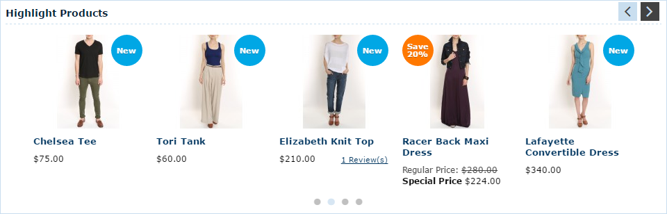
-
Argento Mall design:
<div class="slick-wrapper" data-slick-wrapper='{"el": ".products-grid", "slidesToShow": 5, "slidesToScroll": 5, "dots": true, "responsive": [ {"breakpoint": 770, "settings": {"slidesToShow": 4, "slidesToScroll": 4}}, {"breakpoint": 640, "settings": {"slidesToShow": 3, "slidesToScroll": 3}}, {"breakpoint": 480, "settings": {"slidesToShow": 2, "slidesToScroll": 2, "dots": false}}, {"breakpoint": 321, "settings": {"slidesToShow": 1, "slidesToScroll": 1, "dots": false}}]}'>
    {{widget type="highlight/product_random" title="Highlight Products" products_count="20" column_count="20" template="tm/highlight/product/grid.phtml" class_name="highlight-any"}}
</div>
-
Argento Pure design:
<div class="slick-wrapper" data-slick-wrapper='{"el": ".products-grid", "slidesToShow": 4, "slidesToScroll": 4, "dots": true, "responsive": [ {"breakpoint": 770, "settings": {"slidesToShow": 3, "slidesToScroll": 3}}, {"breakpoint": 640, "settings": {"slidesToShow": 2, "slidesToScroll": 2}}, {"breakpoint": 480, "settings": {"slidesToShow": 1, "slidesToScroll": 1, "dots": false}}]}'>
    {{widget type="highlight/product_random" title="Highlight Products" products_count="20" column_count="20" template="tm/highlight/product/grid.phtml" class_name="highlight-any"}}
</div>
-
Argento Pure2 design:
<div class="jumbotron">
    <div class="container">
        <div class="slick-wrapper" data-slick-wrapper='{"el": ".products-grid", "slidesToShow": 4, "slidesToScroll": 4, "dots": true, "responsive": [ {"breakpoint": 770, "settings": {"slidesToShow": 3, "slidesToScroll": 3}}, {"breakpoint": 640, "settings": {"slidesToShow": 2, "slidesToScroll": 2}}, {"breakpoint": 480, "settings": {"slidesToShow": 1, "slidesToScroll": 1, "dots": false}}]}'>
            {{widget type="highlight/product_random" title="Highlight Products" products_count="20" column_count="20" template="tm/highlight/product/grid.phtml" class_name="highlight-any"}}
        </div>
    </div>
</div>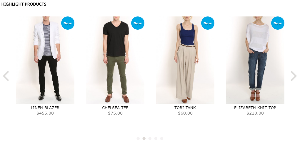
-
Argento Flat design:
<div class="row jumbotron">
    <div class="stub"></div>
    <div class="col-md-12">
        <div class="container hero">
            <div class="slick-wrapper dark" data-slick-wrapper='{"el": ".products-grid", "slidesToShow": 4, "slidesToScroll": 4, "dots": true, "responsive": [ {"breakpoint": 770, "settings": {"slidesToShow": 3, "slidesToScroll": 3}}, {"breakpoint": 640, "settings": {"slidesToShow": 2, "slidesToScroll": 2}}, {"breakpoint": 480, "settings": {"slidesToShow": 1, "slidesToScroll": 1, "dots": false}}]}'>
                {{widget type="highlight/product_random" title="Highlight Products" products_count="20" column_count="20" template="tm/highlight/product/grid.phtml" class_name="highlight-any"}}
            </div>
        </div>
    </div>
</div>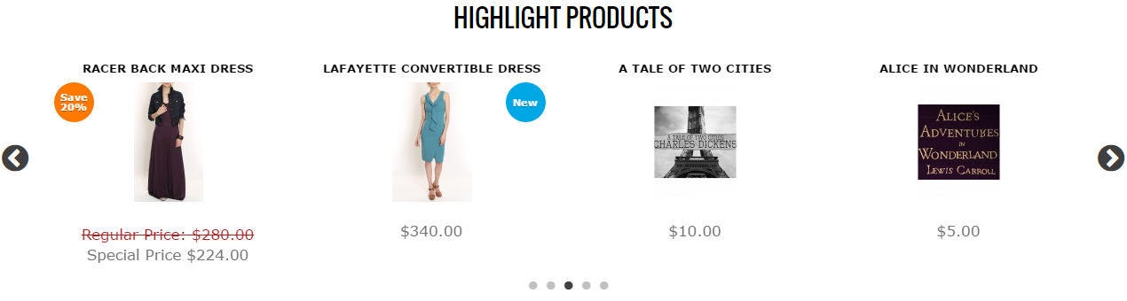
Parameters
Full list of available options and examples is available at slick’s carousel official site.
Arrow Classes
Default slider arrows color is white. When you use slider on the page with white background, arrows will be not visible. To change arrows color, you can add following css classes to slider wrapper:
darkshow black arrowsgrayshow gray arrows