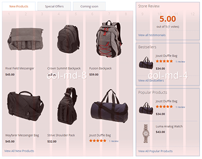
Argento grid system
Argento utilizes the Bootstrap powered 12 columns grid system to organize cms content.
Below is an example of a typical grid markup with three equal width columns on all devices:
<div class="argento-grid">
    <div class="col-xs-4">
        col-1
    </div>
    <div class="col-xs-4">
        col-2
    </div>
    <div class="col-xs-4">
        col-3
    </div>
</div>
col-xs means that this rule will work on all screen dimensions. If you would
like to specify separate rules for different devices, use several classes with an
appropriate suffix.
| Column size prefix | Description |
|---|---|
-xs |
All screens rule |
-sm |
Small screen / tablet |
-md |
Medium screen / desktop |
-lg |
Large screen / wide desktop |
See more examples at official Bootstrap documentation.
Examples


