Theme Editor
- Header Builder
- Category Page Builder
- Product Page Builder
- Footer Layout
- Enable theme editor for custom theme
Theme Editor is a module that comes with every Argento theme and allows you to customize its styles, layout, etc.
Please check the following pages with a description of available customizable options and customization examples for every Argento design:
- Argento Essence
- Argento Flat
- Argento Pure2
- Argento Mall
- Argento Luxury
- Argento Stripes
- Argento Force
- Argento Home
Header Builder
With Header Builder, you can replace static header with a fully customizable one.
Features:
- move header blocks between three rows and nine columns with an easy-to-use drag-and-drop interface
- remove blocks from header
- set column settings and assign CSS classes for it
- preview header layout before applying it on the frontend
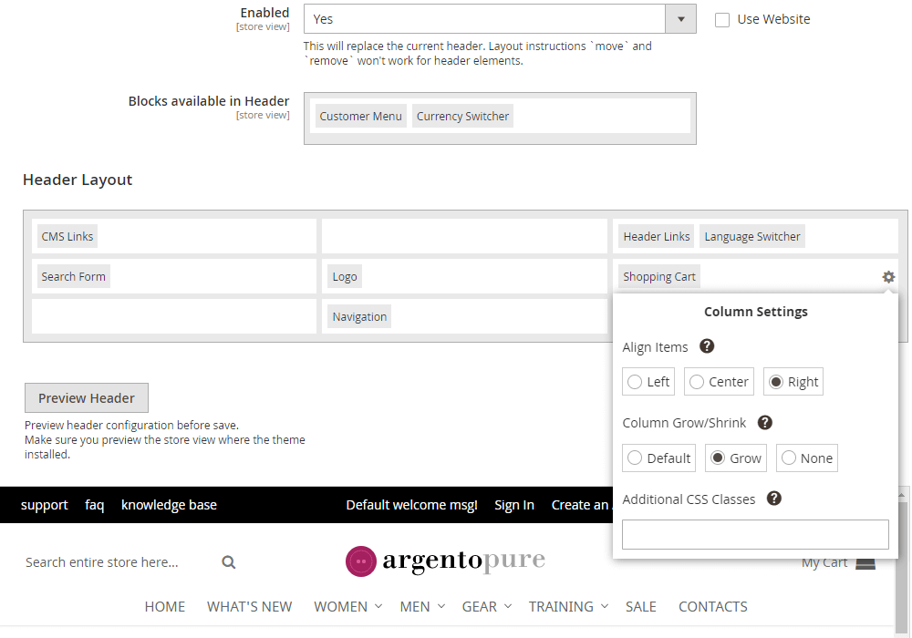
Blocks available in header
| Name | Image | Description |
|---|---|---|
| Logo |  |
Contains store logo and mobile menu button |
| Search | 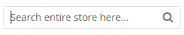 |
You can change the look of search form in Ajax Search Configuration |
| Shopping Cart | 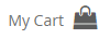 |
Customer shopping cart |
| Navigation | 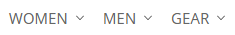 |
You can change the look of store menu in NavPro Configuration |
| Currency Switcher |  |
Allows to change currency |
| Language Switcher |  |
Allows to change store language |
| Header Links |  |
Customer links and welcome message |
| Customer Menu |  |
Customer Links in form of dropdown |
| CMS Links |  |
Displays content from static block header_cms_links |
| Wishlist Link |  |
Displays link to customer wishlist |
| CMS Content |  |
Displays content from static block header_cms_content (used in Argento Essense) |
| Header Slider |  |
Displays content from static block header_slider (used in Argento Force) |
Preview
After you moved blocks or changed columns settings in layout, press Preview Header button
to see how your changes will look on frontend.
You can resize the preview dragging its corner to test layout on different window sizes.
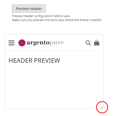
If you like new layout, do not forget to save config an clear cache to apply it on frontend.
Category Page Builder
Category Page builder is a set of options with preview feature to modify the look of category page.
It is available for every theme in Argento package.
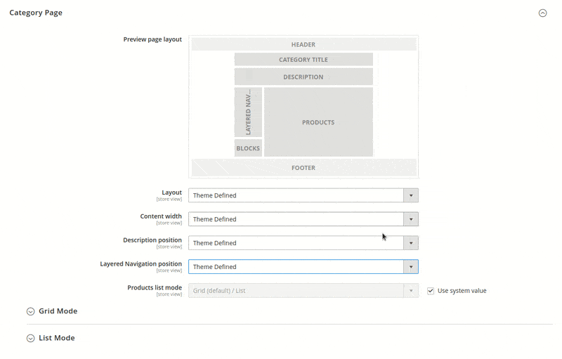
General layout of category page is two columns with left sidebar. Left sidebar contains category filters and some other blocks (e.g. wishlist).
Layout - dropdown to change page layout. Values:
- theme defined;
- one column;
- two columns (left sidebar);
- two columns (right sidebar);
- three columns.
Content width - dropdown to change width of main content. Values:
- full width;
- limited width.
Max width - available only when limited width selected. Set max allowed width for main content.
Description position - dropdown to change category description position. Values:
- theme defined;
- after products list into main column;
- after all columns before footer;
- before products list into main column;
- before all columns after title.
Layered Navigation position - dropdown to change layered navigation position. Values:
- theme defined;
- before products list into main column;
- sidebar.
Product list mode - dropdown to set look of product list. Values:
- Grid Only - Formats the list as a grid of rows and columns. Each product appears in a single cell of the grid.
- List Only - Formats the list with each product on a separate row.
- Grid (default / List) - By default, products appear in Grid view and can be toggled to List view.
- List (default / Grid) - By default, products appear in List View and can be toggled to Grid view.
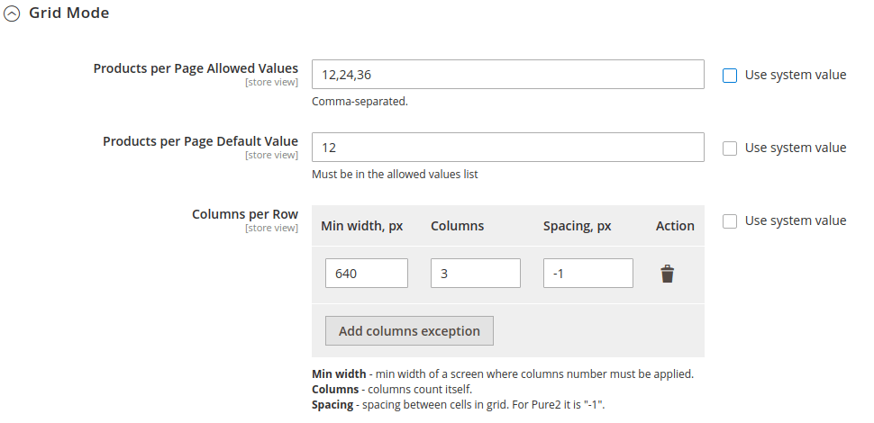
Grid Mode
In this subsection you can determine the number of products displayed in grid view and set columns number for grid.
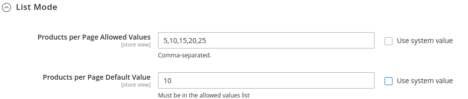
List Mode
Lits mode for category page is not very common. But still it can give your store a fresh look when it is configured properly.
Product Page Builder
Product Page builder is a set of options with preview feature to modify the look of product page.
It is available for every theme in Argento package.
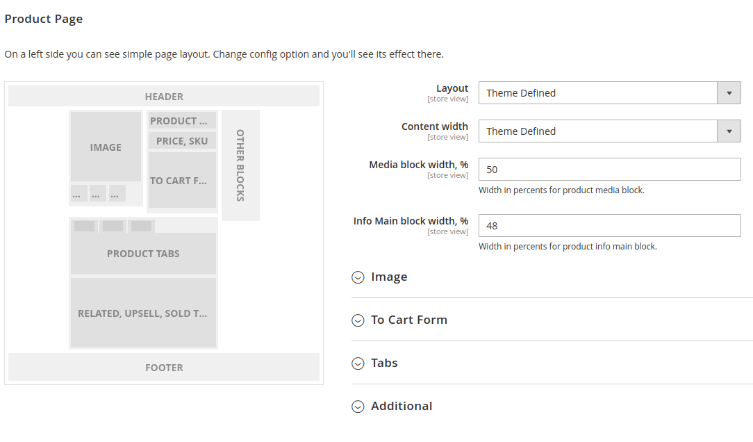
Pure2 and Flat Argento themes have product page with two columns and right sidebar layout. You can change it here. Other valuable options are content width, width of image block and block with main product info. You can get pretty fresh look of product page when you set image and main product info width to 100%.
Image
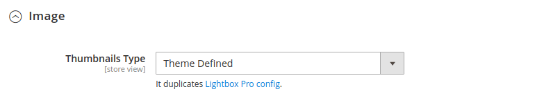
This subsection allows to change position of image thumbnails. It duplicates config of Swissup Lightbox Pro module (check store view level config if you see no changes at storefront).
Values:
- Theme defined.
- Horizontal.
- Vertical.
- Hidden.
To Cart Form

Here you can change “Add to cart form” position at product page. You can move form under product image similiar to Argento Stripes design. Or move it back to its normal position.
Values:
- Theme defined.
- Product Info Main.
- Product Media (bottom).
Tabs
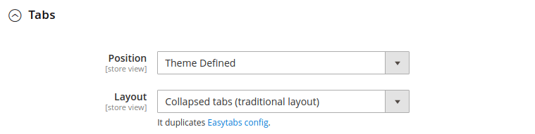
This subsection is powered by Swissup Easytabs module. You can change tabs layout and tabs position.
Possible tabs layout:
- Collapsed tabs (traditional layout).
- Expanded tabs.
- Accordion.
Possible tabs position:
- Theme Defined.
- Main Content - most common position for tabs (under product image and “add to cart” form blocks).
- Product Info Main (bottom) - like tabs at Argento Luxury desing at product page. On right side under “add to cart” form.
Footer Layout
Here you can configure blocks displayed in footer bottom toolbar.
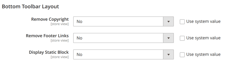
| Name | Description |
|---|---|
| Remove Copyright | Enable to hide copyright block in footer |
| Remove Footer Links | Enable to hide footer links block in footer |
| Display Static Block | Select static block to display in footer |
Enable theme editor for custom theme
You can find this information at custom theme manual