Product Page
Layout
Argento Chic uses 1column layout for the product page. Follow our customization guide
to change it to another one. Or use product page builder in theme editor.
Add to Cart Form
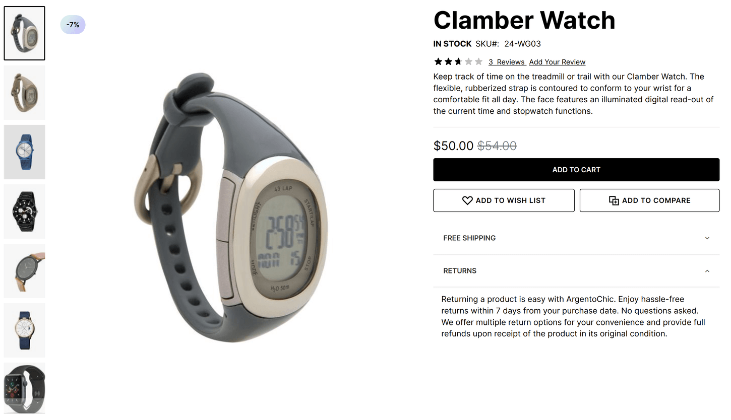
Main part of product page is “add to cart” form. It is on the top of the page in Argento Chic. “Add to cart” consists of product images gallery (left side) and form itself (right side).
Product images gallery is powered by Lightbox Pro module. This module allows you to change thumbnails position and size, enable zoom and change image popup type.
You can also see two tabs under the form: free_shipping and returns. They are created with EasyTabs module and added with widget interface.
Quantity field
Quantity field is hidden by default at product page for Chic design. Check the Show qty field manual to enable it.
Qty field is powered by Quantity Switcher module. By default the qty field is shown as dropdown.
Tabs
Next important part of product page is product tabs. They located under “Add to Cart” form. For the Chic design, the default tabs layout is expanded. Product tabs powered by EasyTabs module. You can rearrange, disable existing and create new tabs with this module. Dive deep into module features and intefaces by checking its docs.
Details tab

This is the tab with product description and additional attributes table.
Reviews tab
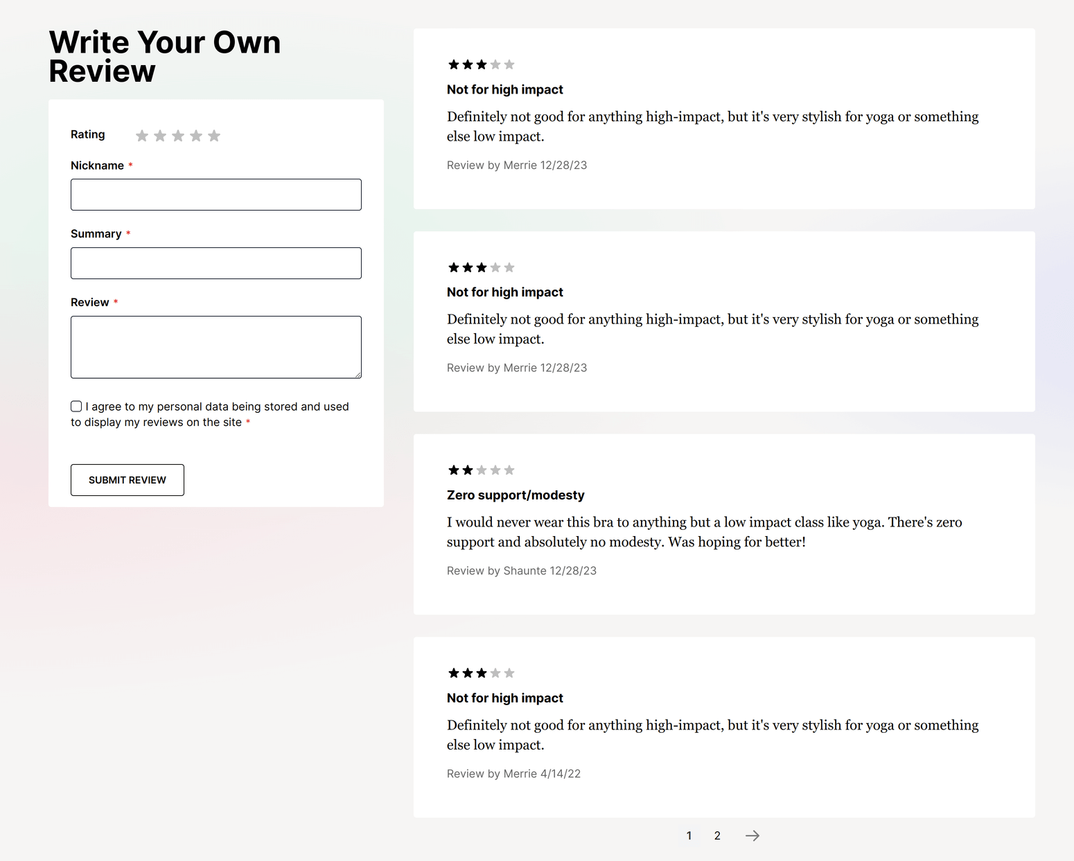
This tab shows product reviews and it is default Magento functionality.
Questions tab
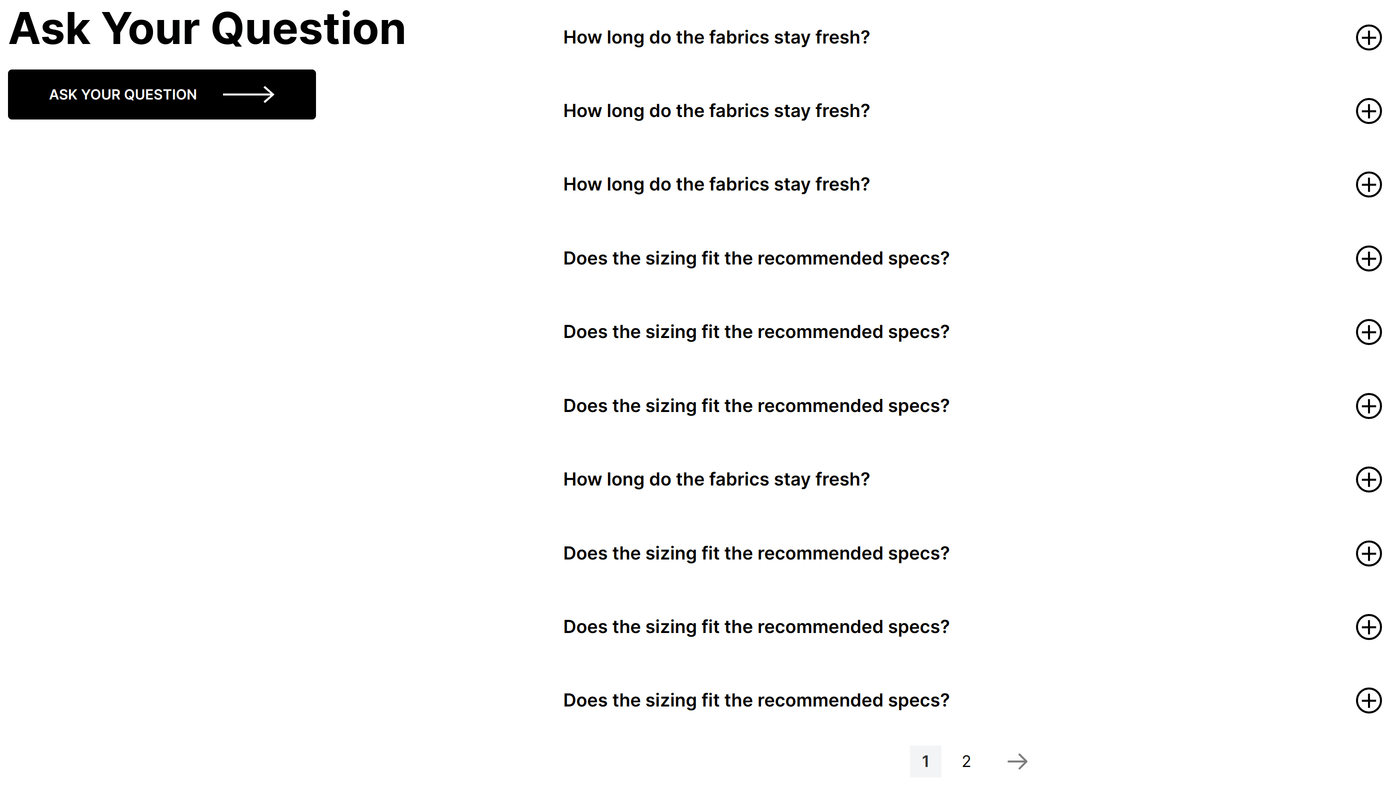
This is product questions tab. It shows “Product Questions” block of AskIt module. As always feel free to know more about AskIt at its docs.
Frequently Bought Together
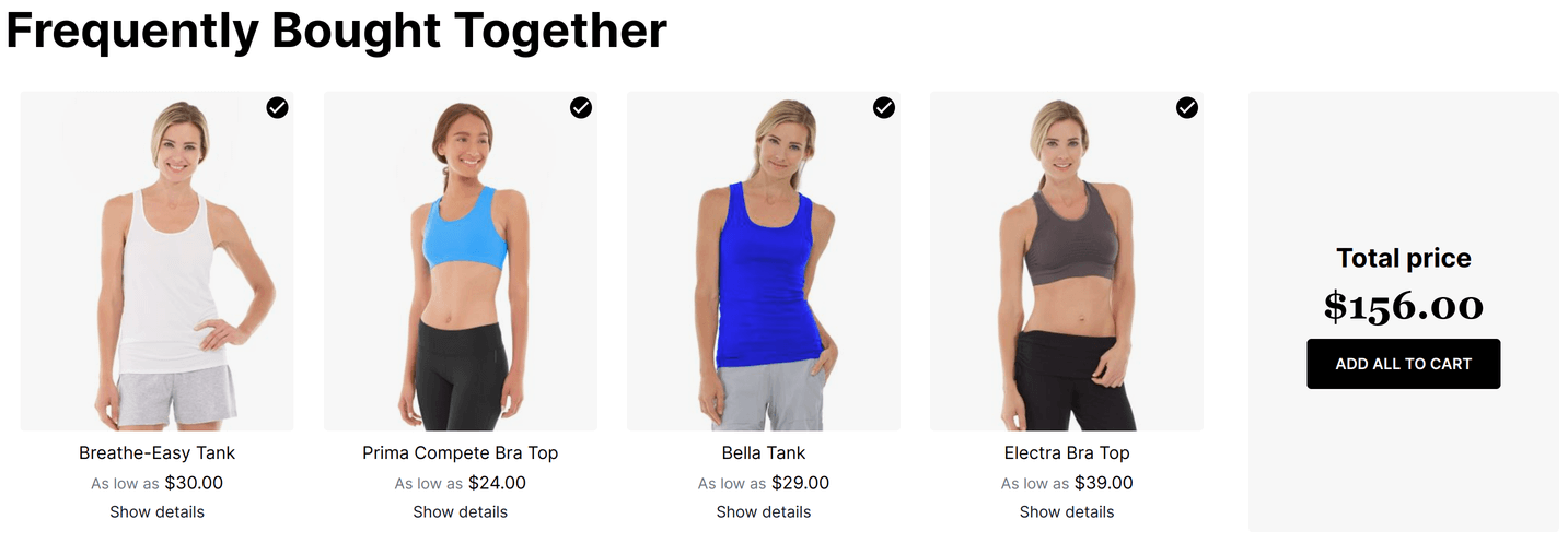
It is “Frequently bouth together” block of Sold Together module. Check its docs to get more details to configure it.
Related Products
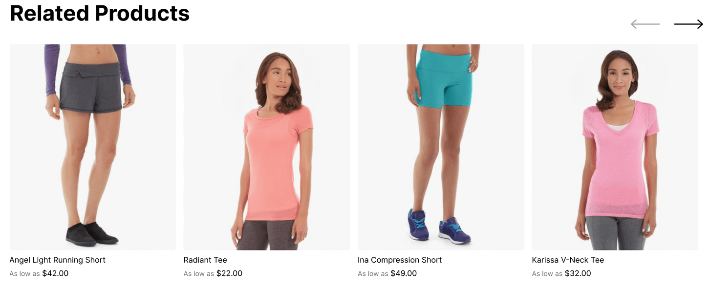
At the bottom of product page there is the default Magento Related Products block displayed as slider.
