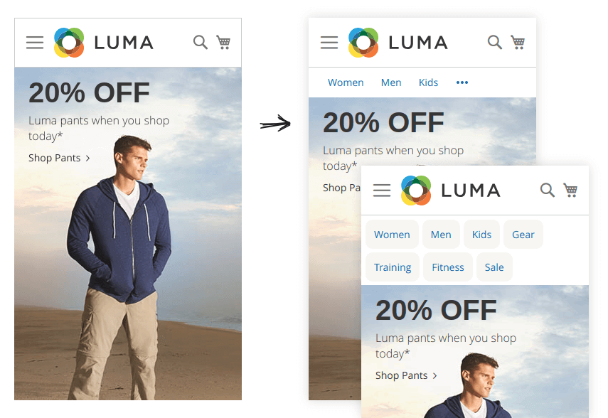
Link Bar - Alternative Mobile Navigation
As you probably know, Magento hides default navigation menu on mobile devices and shows the “hamburger menu” instead.
The problem is many clients do not use this icon, because they simply don’t know that they will find the navigation behind it. This results in decreased category page views, which is obviously not good.
You can read more about “hamburger menu” troubles and possible solution in this great article by growthrock.co.
Let’s create a “LinkBar” menu for mobile devices with top category links and show it under the header:

Proceed with the following steps:
- Navigate to Swissup > NavigationPro page and press Add New Menu button
- Create “LinkBar” menu using “Empty Menu” type. Do not fill the “Replace Top Menu at” field.
- Import your store category tree using Import Item button
-
Press Menu Settings and change the following values:
Option Value Maximal Depth 1 CSS Class navpro-linkbar navpro-nowrap md-hide lg-hide If you would like to show all categories without “More” button, remove
navpro-nowrapclass. In this case we recommend to addnavpro-pillsclass. - Navigate to Content > Widgets page and press Add Widget button
- Create “Navigationpro” widget and assign it you your active theme. Press Continue
-
Fill the form as follows:
Storefront properties tab
Option Value Widget Title Navigationpro LinkBar Assign to Store Views All store views Layout updates Display on Specified Page Page CMS Home Page Container After Page Header Top Widget Options tab
Option Value Menu LinkBar Save the widget.
- That’s all. Navigate to your store homepage from mobile device and check your new “LinkBar” navigation.
Additional styles
You can also combine this menu with other NavigationPro features. For example, if you have a nice icons for all of your categories, you can try to use iconic menu and category tips:
![]()
